

I used the Android App on phone with a colour eReader screen (BigMe Chinese phone) to take me from the Hook of Holland to Lauchringen on the border with Switzerland and back. What a fantastic app. This worked flawlessly. I downloaded offline maps to use my phone totally offline. 10/10 for this software - well done.
I have some suggestions to improve visibility:
1) Can the location cursor be made more 'pointy' so that it is obvious from a distance in which direction you are travelling. From a distance the cursor looks very much like an equilateral triangle.
2) I am a big fan of the cycle node numbering system used in the Netherlands (and Belgium and parts of Germany). These numbers are in a very faint colour font. Would it be possible to present the numbers in black so improving contrast?
3) A scale bar would be much appreciated.
I will try to upload scr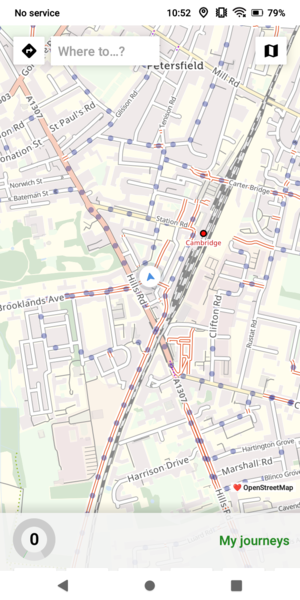 eenshots (this is my first posting so apologies if I fail to do this)


Comments
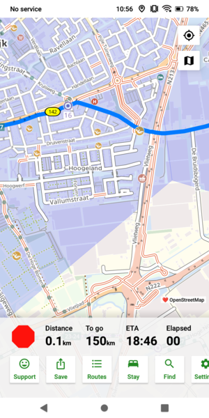
The first image shows the location cursor which from a distance to my aged eyes looks like an equilateral triangle. The second image shows the cycle node number 16 in a very faint font - much less clear than the 142 number beside - could the font colour be changed to black to improve contrast.
Brian, may I ask (not answering your question, which is a task or not for Richard)
Do you follow your route by scrolling the screen? So, no turn by turn prompts?
I have the cursor centred so map moves with me but the cursor stays centred (so I do not scroll the screen it happens by itself). I also had a Garmin Edge that was providing turn by turn prompts.
So, with this app, once the route is downloaded to the phone, the app automatically knows you are moving and follows along - with or without satellite guidance?
I am a cue sheet adherer (sheet attached to my handlebars), so I have yet to take the plunge into the murky waters of nanny satellite. But, some time in the future...
Brian, if you're not aware, we can zoom in the map on the app (now with the volume buttons). That may help with the 'arrow' situation.
There is a limited choice of maps to use offline with the app, but choosing a different underlying map might help with the knooppunt situation. Leaving your data on you can choose even more underlying maps.
Alternatively, you could investigate the display options of your phone itself (normally available under 'Settings'). This may also help with the contrast for knooppunten.
Being familiar with that system, my experience has taught me to either use a planner like CT or use the KPs - not both. As such, more prominent KP symbols would be unwelcome for this user.
Ken,
To use the app offline we first need to download the relevant map as well as the route. Then we can navigate without cellular access but we will need satellite (GPS). To use the app online, simply plot a route and off we go!
It's quite straightforward to test out at home and these days of decent and wide cellular coverage it is not a big deal to be online.
Yes I used the zoom feature with both gesture and the volume keys. It keeps the location cursor more or less the same size and the same with the knooppunt text size. So that did not help with my dim eyesight. Hobbes you are right the text font colour is under control of the map provider so less likely to be changed. The location cursor must be a CT graphic so making it more 'pointy' could only be more helpful (in the interest of clarity).
The CT app is really good. I also use CT on a laptop for route planning which is also really good and I download these routes to my phone (via email) and also to my Garmin via USB (which I use for turn-by-turn). When planning a route on a laptop visibility is not a problem because I can get out the magnifying glass.
+1 for a more "pointy" location tracking symbol, to clarify orientation.
And +1 for Brian R's wish for greater symbol clarity for those of us with dim eyes (and everyone in difficult light conditions). While obviously the spoken instructions usually are sufficient, if the turn is not dead obvious and I am seeking extra info from the map, I find I often need to stop as I can't pick out the info at a glance.
Might red be a better symbol colour, ie contrasting with the pale blue of the planned route?
(An ability to set the symbol colour (and size) as a user preference would obviously be a yet greater sophistication, but I'm guessing that would require a materially greater scale of software development.)
I don't intend this as an advert for a specific cycling computer, but I find that it is very easy to follow a cycle.travel route on a Wahoo Elemnt Roam when you ride with the screen on the device's Map page, as shown below:
The Wahoo map is relatively uncluttered, with sparing use of colour.
Your own position (the triangle) is always at the bottom centre, and the downloaded route is prominent as the bold dark chevron line.
By default, the distance to the next turn ("cue") is shown in large font at the top right.
Turn-by-turn instructions (whether generated by the Wahoo or C.T) do pop up as you approach the turn, but I find that I do not need to read these, as I am already anticipating where to go.
I don't ride audax, but do cover shorter audax-like distances (20 over 100 km this year).
Chris
Chris, how long does the battery last when you have it set on Map Page? For Audaxes of 125 miles - say ten hours of riding - I wonder how effective it could be.
For greater visibility. have you thought of switching to the Ace?
Ken, my experience is that the Roam v2 gives 15 hours without charging, regardless of being on the Map page. I used to carry a Veho Pebble battery pack, but don't bother now.
I have just bought an Ace, just 'cause I love Wahoo. It didn't deliver battery life at first, but firmware updates have pushed it to the stated 30 hours - a recent ride still had 78% after 7:16 hours.
Chris
Thanks Chris, that's helpful.
I am planning to move into the new century of using routing devices instead of paper cue sheets - they have never failed me yet and never run out of battery power ;-) - but needs must so I don't end up a dinosaur, so using a Wahoo ( I do have one but only for miles completed) Ace and either RWGPS (Premium member) or Cycle.Travel for routing is the next big step.
I ride maybe 8,000 miles a year on known routes but LeJog is coming up in three months, so time to get out of nappies and into big boys trousers, I think.
Thanks again,
Ken.
Ken, one other suggestion for UK riding (50 to 58 degrees latitude): for much of the year I don't ride with sunglasses; it's just not that sunny, and tinted lenses make it slightly more difficult to see a cycling computer display.
I wear clear plastic glasses (from Galibier in Northern Ireland) and these make it better for making eye contact with car drivers. A subtle effect, but drivers see you as more human I think.
Chris
Chris, All good points, and anything we do which makes drivers look on us favourably must help.
Ken.