

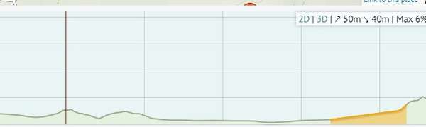
Hi all, I am wondering if there is a key to the elevation chart that explains what the colours mean. It appears that there is something more than obvious going on with the colours. Looking at the short ride below, there is a orange section on the right that starts with a gentle gradient. But there are steeper sections earlier in the ride that are not coloured. Can anyone explain how this works.
Thanks Colin


Comments
It’s averaged over a short distance - otherwise the chart would be unreadable due to repeatedly changing colour on climbs.
Thanks Richard. So why no colours in the earlier gradients. I have included the screenshot again with horizontal axis.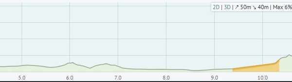
I think Richard has already answered this?
On a route we can see the elevation gain and fall in numbers, in graphical form and the steeper gradients receive highlighting in the form of colours. Bear in mind that these are all estimates (albeit pretty good ones) and using binary code means that sometimes a section with 4.9% gradient receives a different colour to one with 5.0% as an example. Damned if I can feel that difference on the bike but then again, I'm not a computer.
A coloured profile route like the one below would not be as useful if every little elevation bump was highlighted.
https://cycle.travel/map/journey/462328
At a glance I can see I have a hefty climb at the end of the day. I can see the steepest climbs but not all climbs. I can drill down further if and when I want to. The elevation graph is zoomable too. That might make it clearer in your example why one is coloured and the other not.
Some of my hardest days in a saddle have come on days when CT has no colouring at all - just gentle, rolling hills. Lots of the buggers. And a headwind didn't help.
I can't stress enough the importance of treating CT as a tool. When it comes to elevation, it is an estimate, a best guess, a guideline. For example the Max gradient can be very misleading - it may just be one hairpin bend on a 100km route. Meters climbed, % gradient are only parts of the "measurement" of a climb. Road type, road surface, traffic, mood, fuel, hydration, temperature, wind, precipitation, humidity, load, tyre pressure, fatigue, time of day and company can all be significant too. Sometimes a farmer blasting music out of his tractor as I struggled up to a volcano was worth a % or 2 off the gradient!
Also, OSM data varies in quality from place to place. That means that in some places CT will be more accurate than in other places. I'm pretty sure it would be more helpful if you could post a link to the route as opposed to a picture (simply copy and paste the URL so long as it's not private).
Hi HobbsOnTour, thanks for taking the time to reply to my query. But I still don't understand. Why no colouring around the 6km mark on my original chart. This would not make the colouring further along unreadable. And what about the chart below? Very little colouring vs the next chart below. Is there some sort of cut off for this colouring information? I am just trying to understand what the colouring is telling me. And is there a key for this colouring?
https://cycle.travel/map/journey/533343
https://cycle.travel/map/journey/521564
The calculations broadly take a 100m stretch and colours it orange for an average of >3.5%, red for >7%, maroon for >10.5%.
However the start point of each 100m stretch depends on the route, so if you drag the start/end points of your route you may see that this changes the points at which the 100m sections begin, and therefore affects what’s coloured and what isn’t. For longer journeys, the sample interval will go above 100m to avoid lots of short little sections.
As always, the elevation graph is only a guide – the grid resolution and surveying issues of the source data (SRTM) mean that it can only ever be an approximation to the hills you’ll meet out on the road.
Excellent, thanks very much Richard. That helps me understand what I am seeing. Much appreciated.