
Become a supporter
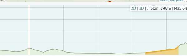
Hi all, I am wondering if there is a key to the elevation chart that explains what the colours mean. It appears that there is something more than obvious going on with the colours. Looking at the short ride below, there is a orange section on the right that starts with a gentle gradient. But there are steeper sections earlier in the ride that are not coloured. Can anyone explain how this works.
Thanks Colin
Hi folks, I notice sometimes routes do not have any surface information (busy road%, paved road% etc). See screen shot example. I know this is a short ride but many other short rides have info. I suspect it is because there is only one type of surface. And ideas?

Hi everyone. Let me start by saying I love cycle.travel and have been using it to plan a cycling trip along the Scottish canals in 2025. And I have used its elevation information over google maps. But I live in Australia and just went on a short ride around Melbourne suburbs to test things out and found the elevation info in cycle.travel way off (smoothed out) but found the same info in Google maps much closer to the mark. So what is going on? Is it because less work has been put in to Oz? Ultimately, my question is: should I be using cycle.travel for elevation info in Scotland or should I use Google maps?
I know elevation is a bit issue in this forum so sorry for revisiting it. But it would be good if someone can help me choose.
Thanks


Made in the Cotswolds. Published by Éditions Système D Ltd.
Log in with your cycle.travel account:
| Password |
Or simply use your account on:
