

On most topographic maps*, the shade used to reinforce relief assumes a light source at the North West (OpenCycleMap and OpenTopoMap are examples). Reality is otherwise, but this somehow is natural to the brain, and it gives a good impression of the actual landscape.
On cycle.travel however, the shade seems to only depend on the norm of the elevation gradient, i.e. the steepness of the slope. This results in pictures such as the one below, where valleys and ridges are hard to distinguish on first sight.
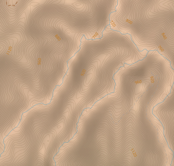
Would it be possible to modify the shading formula so that it gives better/more standard results?
*at least in the northern hemisphere.


Comments
Coincidentally I'm experimenting with this at the moment – the new version of the program that does the hillshading (GDAL) has some interesting new options. Watch this space!
Oh, that's great, I'm looking forward to it!
I’ve just made a new version of the hill-shading live for Europe (not America yet). It uses the new ‘multidirectional’ shading in GDAL which gives a really good view of the lie of the land. There’s still a few tweaks I’d like to make but I think it’s looking better!
You’ll probably need to do a shift-refresh for the new tiles to come in.
(Here’s an example where I’ve been testing it: Winchcombe, Gloucestershire, UK)
It's looking better like this, bravo!
One suggestion: the darkest shade should be a bit lighter, as it is now the contrast in mountains can be too high (in my opinion). See around Saint-Christophe en Oisans (FR) [1] and compare with OpenCycleMap [2]. In any case, it's much easier to read the map now.
[1] https://cycle.travel/map?zoom=13&lat=44.94154&lon=6.22409
[2] http://opencyclemap.org/?zoom=13&lat=44.94154&lon=6.22409&layers=B0000