Hi,
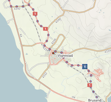
I sometimes struggle to pick out rail stations when there are cycling routes about -- particularly when I can't be bothered to dig out my glasses ;)
In the attached example, it's certainly possible to identify the existence of a rail station, but I feel like it's more difficult than it needs to be, especially on smaller screens.
I wonder if the symbol for a rail station could be more distinct from bike routes; e.g. a different shape and/or color. Thanks.